
 by Quantal Langford With the influx of imagery and content in social media today, it can be competitive for businesses, brands and organizations to grab your attention and on a daily basis. I find myself being ingrained in this part of the content creating machine. Designing imagery that can be used to provide information, evoke emotion or create a call to action. While many designers have their own personal styles, these are 3 tips you can use to create your next great image for your social media campaign. Content is King Content should be the main focus of any design. This will range for various images. If you are displaying information in an infographic design; yes there will be a large amount of text and graphics, but if designed well should be readable. If evoking emotion, I usually keep any text to 2-3 lines at max. If I'm creating a quote graphic, I keep the content in the forefront with a background image, that's relating to the quote in the back or making sure there's enough copy space to place the quote. Design is about communication and experimentation, you can play with this and see what works for you. 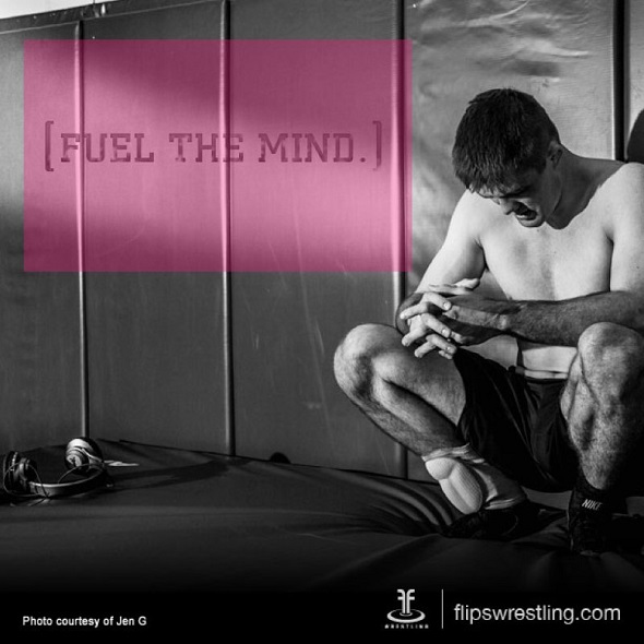 In the example above give your main content the right amount of text to allow your main message to breathe. If creating a call to action, when advertising a product or service, I create a balance with the product and text. maybe the image to the right or left, with the headline and sales copy to the opposite side, or the sales headline at top, product image in the middle, and the call to action text (website, price, etc.) at the bottom. See what works for you. Find your Balance In design, it's always necessary to find your balance. Symmetrical balance, Asymmetrical balance, usage of white space, color contrast. These rules help aid in creating social media graphics that reads well, keeps the graphic uncluttered and to the point. With the immediacy of social media today, it's important for that social media graphic to resonate with the viewer in a short amount of time. For this example a graphic I designed, for Flips Wrestling, evokes the emotion of the viewer, with the image of their product in the background. The simple placement of "Fuel the Mind." that lines towards the main image of the wrestler kneeling down, after a tough workout. 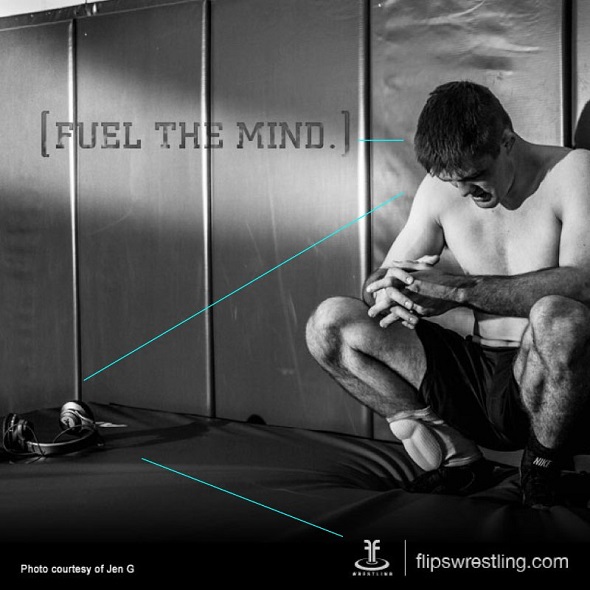 The head of the wrestler bowing down, leads your eyes towards the main sell of the image, which is the headphones. The headphones lead down towards the bottom right where you have the call to action text. Which in this case is flipswrestling.com, along with their logo at the bottom right corner.
This leads into my last tip... Call to Action Many social media images have some kind of call to action in someway or another. Websites, Hashtags, "Shop Now" buttons, "Click here" buttons. Some are big and bold, while others are more subdued with the imagery. Creating this call to action, leads your potential viewer away from the stranglehold of their favorite social media portal to where you what to lead them. It could click towards a well designed landing page or website to a download for a free ebook. Anything is possible here. Quantal Langford runs a freelance design and consulting studio called Langfordesign, focusing on brand identity for businesses, brands, non-profits and athletics that helps to resonate with their audience. You can email him at [email protected] or visit langfordesign.com, thanks for JenGPhotography and Flips Wrestling for the great image to use as the example. Comments are closed.
|
Categories
All
Archives
December 2023
|
 RSS Feed
|
Copyright © 2023 Oceanside Chamber of Commerce
928 N. Coast Highway | Oceanside, CA 92054 Tel 760-722-1534 [email protected] Privacy Policy Map/Directions |
|